WordPress Site Revamp
I made improvements to a WordPress site built by David, a friend of my dad’s. It’s a reelection campaign site for a county councillor, and was originally very bare-bones with a large amount of text content. I knew that keeping the top-level design simple would be key for a political campaign website. Most users would already be leaning one way or the other, so session times would be short as long as the key information was front and center.
Click here to check out the site.
INITIAL ASSESSMENT
I logged in and got my bearings in the dashboard. Most of it was familiar to me from my previous job, though that company mostly used builders like Elementor or Beaver Builder. This site was made with the WP Block Editor, which was a new but mostly intuitive experience for me. Even though there was a lot of planning to do, there was a bit of triage first. I set the primary domain of the site to the one that was purchased for it, then assessed which WP subscription level David would need to upgrade to (it was Premium for access to custom CSS).
RESEARCH AND SCOPE
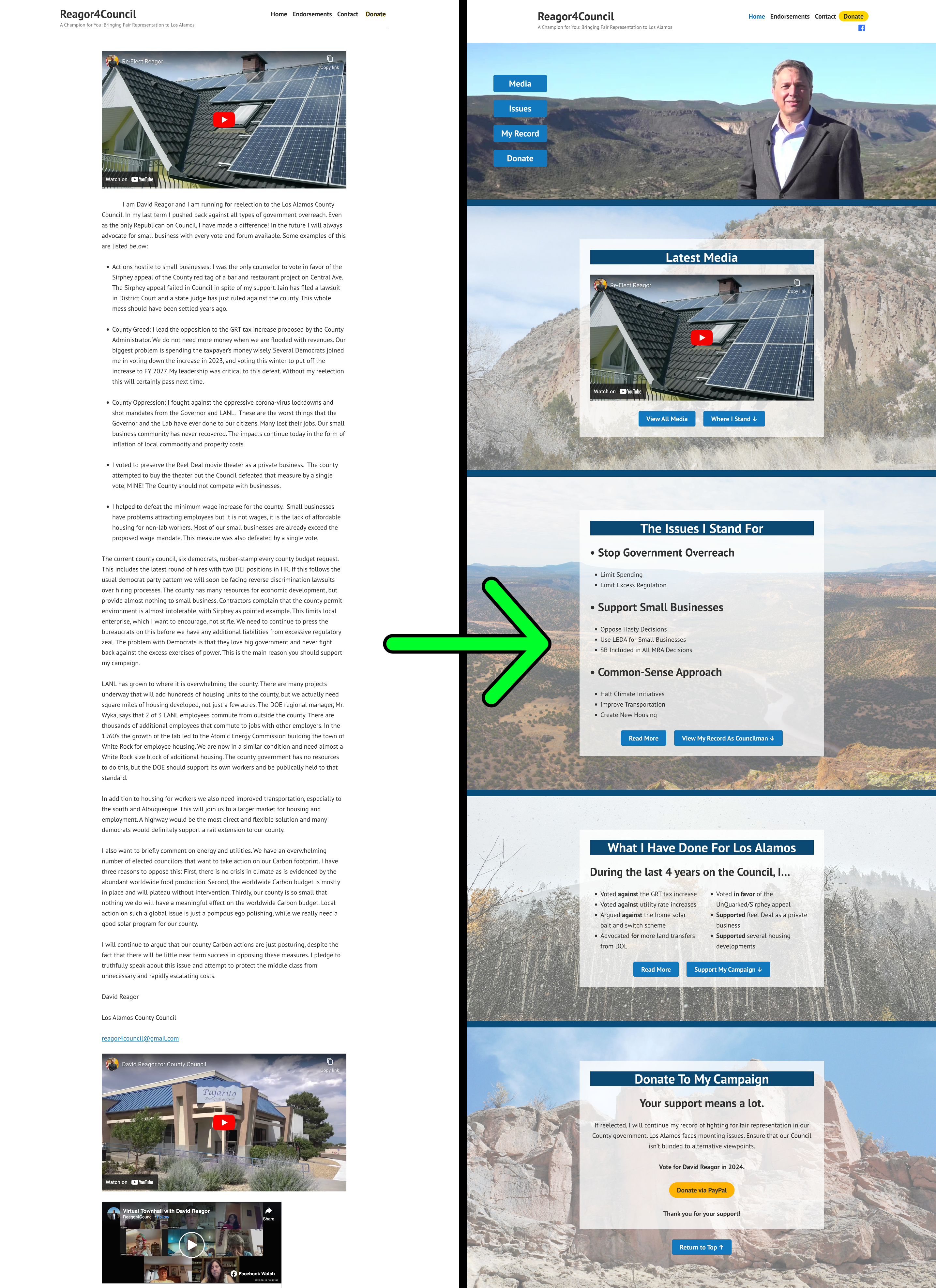
Before doing anything else, I checked out existing campaign sites for inspiration and guidance. I found an all-in-one political site builder that had some great examples. These gave me ideas about how to distill the site content into a concise end product. I divided the existing info on the site into three main categories: print and video media, David’s record as an incumbent, and his political stance on local issues. This outlined the scope of the project: a new homepage with three main sections, each pointing at their own page where they could be expanded upon. A donation link and an accompanying homepage section would also be included. I didn’t dig into things like different themes or other sweeping changes to keep myself from falling into any rabbit holes during what would otherwise be a simple favor for a friend.
DESIGN CONSIDERATIONS
Mobile-first development was essential. I generated a QR code for David to use in physical media and anticipated that almost all users of the site would be viewing it on mobile. Thankfully, the theme and block builder had me covered for most of it, but there were a few egregious issues that required some custom CSS. I felt that screen real estate wasn’t being used to its fullest extent, with too much sacrificed for margins and padding. There were also a few other changes, like adding custom styling to navigation buttons, fixing the alignment and width of embedded YouTube videos, hiding the otherwise unhideable blogging features on a site that would never be used as a blog, removing the ugly default page titles inserted by WP, and adjusting some heading sizes to prevent widows.
DESIGN STRATEGY
My design strategy was fairly simple. Everything flowed naturally from the intended user journey on the homepage. I included opportunities to branch off into deeper content, but also included buttons to flow directly to the next section of the homepage, culminating in a link to the donate section. I found some free landscape images from David’s county on Unsplash and featured them prominently on the site. A few splashes of color also helped to bring the site further from the Richard Stallman aesthetic.
RESULTS
I’m happy with how this project turned out. I did what even my old company often failed to do by keeping the project within the original scope. In hindsight, that was probably easier because there was no money involved. Scope creep reared its head a couple times during the project, but I was always able to explain why it was unnecessary (or that it would be David’s responsibility as site owner and editor once I finished my work). When viewed side-by-side, my version of the site is a clear improvement on the old one, so my goal was accomplished.
Thank you for reading! If you have any questions, feel free to contact me.